

Hello again Yankees fans and family, here’s a quick history
lesson for you as we close up shop for another night here on The Greedy
Pinstripes. The history behind the historic and well-known New York Yankees
logo.
What makes the logo so historic? Well it wouldn’t be nearly
as historic or well-known if the team wasn’t as successful as it has been
throughout their history. As we are set to enter the 2017 season the Yankees
have 18 American League East Division (and division titles before there was an
American League East) titles under their belts along with 40 American League
pennants and a whopping 27 World Series championships. With success on the
field comes success off the field as well which is evident by the 44 players
from the Yankees and 11 managers who are currently in the Hall of Fame for the
team.
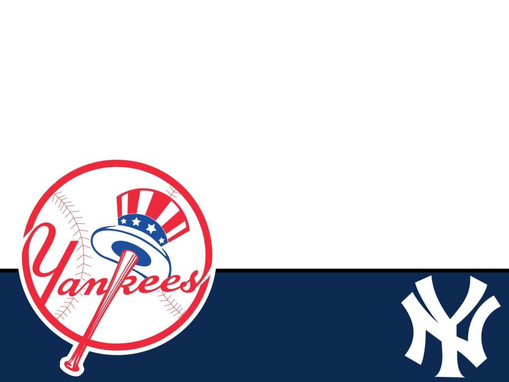
The interlocking “NY” has been the Yankees logo since the
1913 season when the team has eight different variations of the logo. The logos
were all basically the same with slight variances in each where the bat and
ball logo with the word “Yankees” written in cursive has been around since the
1947 season. The bat and ball logo changed once in 1968 and has remained the
same ever since.
Uncle Sam’s hat sitting on top of the bat and the
strategically placed “K” in Yankees just screams “America’s Team” to me and I
wouldn’t change a thing about either logo if I could. Well maybe I’d put a
“Brought to you by Daniel Burch and the Greedy Pinstripes” somewhere but that
just may be me tooting my own horn. Sue me.
No comments:
Post a Comment
Sorry for the Capatcha... Blame the Russians :)